Mobile App
iOS
Every Craving.
Every Scene now.
Product Design
UX Strategy
UI Design


Mobile-first theater food ordering app saving time from concession lines
Details
Snack O!
Portfolio Spec Project (Google UX Design)- inspired by real-world cinema chains like AMC & Century
Timeline 3 week Design Sprint
Role UX UI Designer
Research · Wireframing · Prototyping
Overview Mobile-first commerce + time-sensitive food delivery. Used market data + usability testing to create production-grade flows applicable to live cinema chains

THE PROBLEM
It’s a trade-off ---> enjoy the movie start OR satisfy cravings?
Movie lovers often have to choose queuing up for snacks or missing some initial movie moments; and especially for those who arrive late it’s a disappointment.
The pressure to make fast decision in that queue and not able to customize snack is another dissatisfaction The theatre atmosphere adds constraints like low light, limited time. This friction leads to poor customer experience and lack of sales for the theatres
I wondered: What if you never have to leave your seat?
And the easiest way to do that is download the SNACK O app!
The lights have dimmed. The trailers began.
You sink into your seat—excited, comfortable, and immersed. Then it hits you.
O Snacks! Popcorn? Or Something to drink? And rush out….?
But it’s a trade-off- enjoy the movie start OR satisfy cravings?
Too distracted to
enjoy movie
Moviegoers leave their seats, stand in lines, and miss key moments just to grab food & drinks. What should be a seamless experience becomes interruptions.
From seat-snacks in
few taps
Browse the menu, place orders, and receive food directly at their seats — and delivery through a streamlined mobile workflow.
More Convenience
Less time away from movie
Turn every seat into an ordering opportunity; theatres to increase sales while guests immersed in the show.
THE PROBLEM
THE SOLUTION
THE OUTCOME
THE SOLUTION
App + Delivery at seat + Easy checkout = Enjoying movie from start
Design a mobile-first app for movie goers to place an order, have options to pick up or deliver at their seats, pay securely and track delivery in real-time.
The goal is to have a seamless movie experience and save their time from concession lines at café


THE RESEARCH
Understanding the Context.
After conducting an informal survey N= 10 Movie-goers + Staff (no age limit group)
74%
Dissatisfied with the current process of ordering
65%
Movie-goers missed movie time due to long queues
88%
Movie-goers would prefer ordering from phone
92%
Thought the concept to be good and effective
77%
Staff feel overwhelmed during peak hours
64%
Staff face order accuracy issues due to crunch time
With qualitative study;
What the users have to say......
"Even with pickup option at the counter, I waste time in a line; I would prefer in-seat delivery"
"I usually buy the same snacks every time; the menu board feels chaotic when I'm late for my movie"
" I always have to manage to get early to the movie so as to buy snacks for my two kids. It becomes difficult to handle them in queue
The user research strongly supports the product market fit
User Pain points that
shaped the product.
Time Crunch
Long wait times in queue for ordering snacks right before the movie or intermission; leads to anxiety
Discomfort
Overall disrupted movie experience going out and getting the food
On Counter Communication issues
Noisy environment and queue pressure leads for rushed and unclear decisions
Payment Issues
Payment failures, limited options or cash-only adds up distress
Through interviews and contextual analysis, I discovered statistics that reflected the most common friction areas for the users. This helped me to synthesis the data into an opportunity map; that shows where design intervention creates value

Identified target audience and validated demand by conducting surveys and theatre observations.
Based on patterns from the user research insights I developed personas to help me empathize with users and define the product.


DESIGN GOALS
User needs into
Product Features.
Fast ordering with minimal steps for efficiency. on-the-go that will let users place an order from their seat
High-contrast UI for usability in dark environments. User-friendly interface and navigation with 0 learning curve with visual elements.
Reassurance that order is confirmed to be delivered at seat. Building trust and assurance
Real-time order tracking for an uninterrupted screen magic
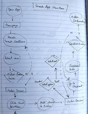
Sketching users flows
& Ideas to Life.
To establish user flow and content layout, I sketched out wireframes for screens that users would need in order to complete the order.
Initial wireframes explored multiple ordering flows, menu layouts, and checkout structures to understand how quickly users could move from browsing to payment. Iterations focused on reducing cognitive load by minimizing steps, keeping essential actions visible, and ensuring that users never lost track of their order progress.

User is excited for the movie
with his snacks delivered quickly at seat
Checks the cart, pays and then
receives order confirmation too
Feels happy to see how quick and easy it is
User thinks of using the app
to order and opt for seat delivery
User is anxious as not enough time to get snacks and return before the movie starts
Trailers are running, movie
is about to start
WIREFRAMES
Behind the Scenes.
Landing Screens

Main navigation screens

Options screens


Order details and confirmation screens

Profile screens
TEST & ITERATE
Learnings that
actually sticks.
I conducted a round of unmoderated usability testing on a Low-fidelity prototype to identify any core issues.
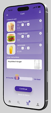
Single drag toggle replaces both buttons.
Task completion: +25% (67% → 92%)Decision time: -75% (3.2s → 0.8s)


All critical info (movie screen + time + seat + price) visible at-a-glance, with payment method cards right below.
Checkout abandonment: -38%


DESIGN SYSTEM
Bold. Joyful
Snack O was picked as the app name for its lighthearted and abstract connotations of 'Ohh Snacks! and 'Snacks-on-the-GO'
Logo Iterations.
Style Guide
Purple - the brand color symbolizes fun, luxury, and entertainment magic, while offering high visual contrast for accessibility with contrast ratio of 7:99:1 under the WCAG 2.1 guidelines

THE MOBILE APP
Order · Track · Enjoy
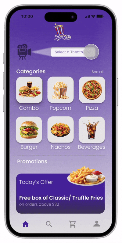
Simplified Menu
The design focused on simplifying the menu to reduce decision time and interaction effort inside the theatre.
Instead of dense category navigation, the home screen surfaces the most commonly ordered snacks in a clean, visual grid, allowing users to quickly scan and add items with minimal scrolling.
Theatre selection is placed upfront to streamline ordering, while promotions and add-ons are positioned lower in the flow so they do not interrupt quick ordering.
Delightful Confirmation and Tracking
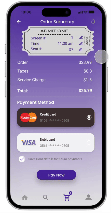
A complete summary of tickets, seats, food items, taxes, and service charges, allowing users to review details and choose a payment method before confirming payment.
A confirmation screen reassures users that payment is completed, using celebratory visuals and a clear next action to proceed to order tracking.
Shows real-time order status, estimated preparation time, and item details, helping users track food delivery while waiting for movie to start/resume
Seamless Transitions
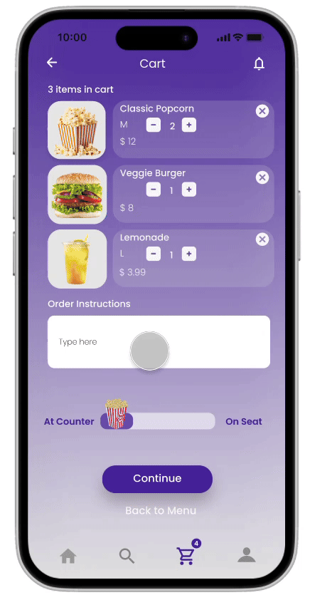
App cart displays food items with quantity controls, delivery preference (seat or counter), plus an option to add order instructions.
With easy-to-scan screen and seat options, users can-
-
Quickly choose their movie screen and showtime,
-
Pick available seats visually, with selected seats clearly highlighted before proceeding to checkout.
Final screen summarizes tickets, seats, charges, and total cost, then enables secure payment via saved or new payment methods.
The design emphasizes clarity, minimal effort and clear CTA buttons
THE EXPERIENCE
Fresh bites,
delivered at seat.
Conducting test again with the high-fidelity prototypes helped structure key usability KPIs that can be quantified like:
-
Reduced queue time (users happy using at seat delivery options)
-
Order accuracy improvement (task is on time and with no error rate)
-
Increase in average order value (upselling + promotions)
Based on the feedback and followed by iterations, the final mockups are :


REFLECTIONS
What's Next?
With pilot testing in real-theatre environment, the next steps would be to iterate and design for features beyond this MVP:
-
Improve order pickup & delivery experience
-
Personalization and time-based recommendations (snacks before/at interval of movies)
-
More inclusive UI design (screen readers, ADHD profile implementation)
Key Learnings:
-
For environments like theatre and users like movie-goers; Time-sensitivity drives the decisions
-
Menu Simplicity improves predictability & conversion
-
UX and Usability study extend beyond the UI app design
“Designing for movie food ordering gave an insight that good UX is not just about screens, but about designing
seamless moments between anticipation, convenience, and entertainment.”


